

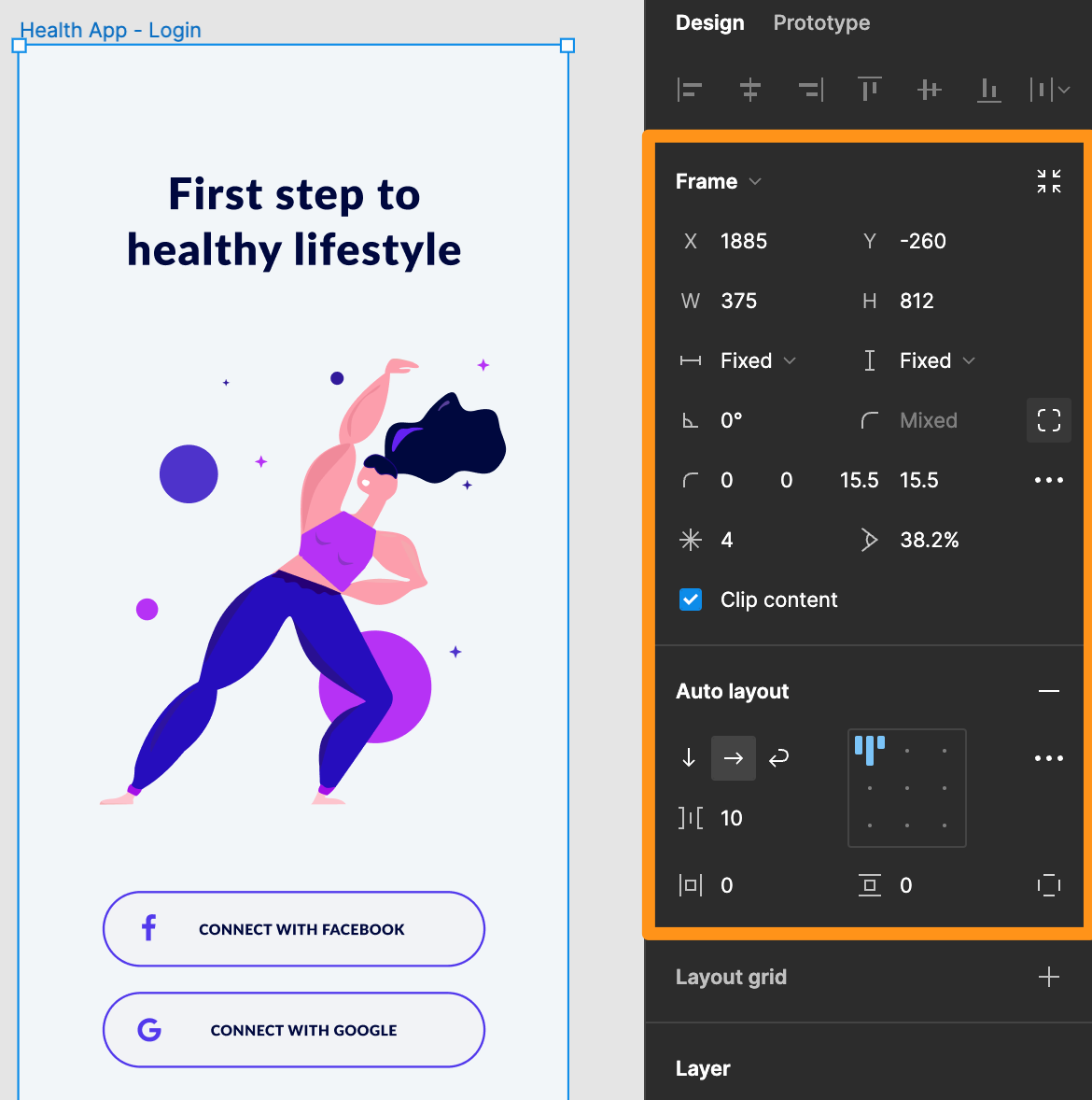
Localization at the design stage is a principle which empowers teams to begin the localization process before development of an app or software starts. By using the UI design of the app before development begins, text that requires translation can be extracted from the designs to kick-off localization early on in the process; starting localization early saves teams valuable time to market. By addressing localization during the design phase, companies can significantly reduce the time and cost of adapting their products for different markets and locales.
A key consideration for localization at the design stage is text expansion. The translated text often takes up more space or requires more characters than the source text used when designing the app. It is very common when translating content from one language to another since languages can vary drastically in characters, grammar, syntax, and overall word lengths.
Text expansion can result in layout issues, truncation, or general UI problems if not properly accounted for before or during the localization process. Examples are text being cut off or overflowing to overlap other text elements.
However, adjusting design files to account for different languages can be a tedious task for even the most experienced designers. Luckily, the Figma Auto-Layout properties can be applied to your designs to streamline the localization process.
The Figma Auto-Layout property options is a powerful tool you can add to frames and components. It enables you to create designs that grow and shrink to fit in response to text changes. This way, this Figma feature can save you time and prevent headaches as your designs automatically adjusts to longer translated text.
There are several Auto-Layout options that are helpful for localizing designs. These options and properties, when applied to a frame, element, or component, ensure you have a smart design element that is responsive to resizing, as needed, per language. You can even nest Auto-Layout frames within one another to create completely responsive designs of complete screens.
Below are some examples of commonly used Figma Auto-Layout properties and how they can be used for localization at the design stage.
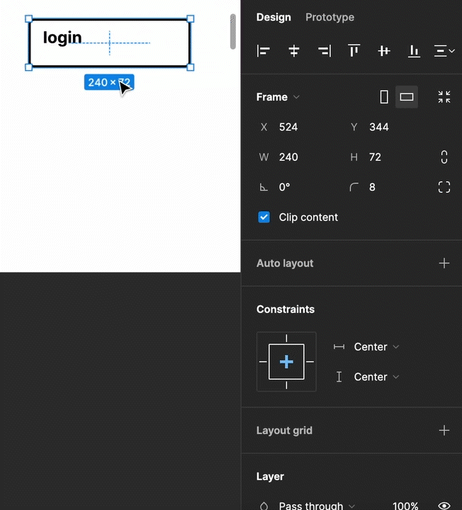
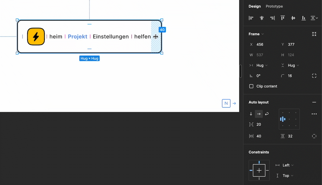
Resizing is one of the most versatile ways to improve the responsiveness of a design for localization purposes. This behavior determines how frames change in response to their contents. You can set elements to stretch, shrink, or maintain their size. You also have the option to adjust both vertical and horizontal values independently. Some of the most helpful resizing options include:
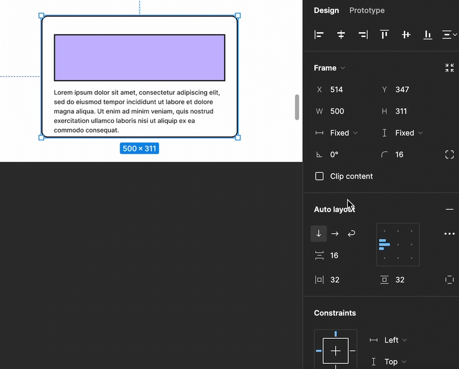
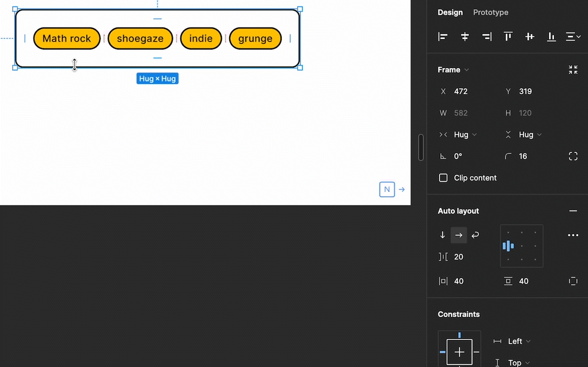
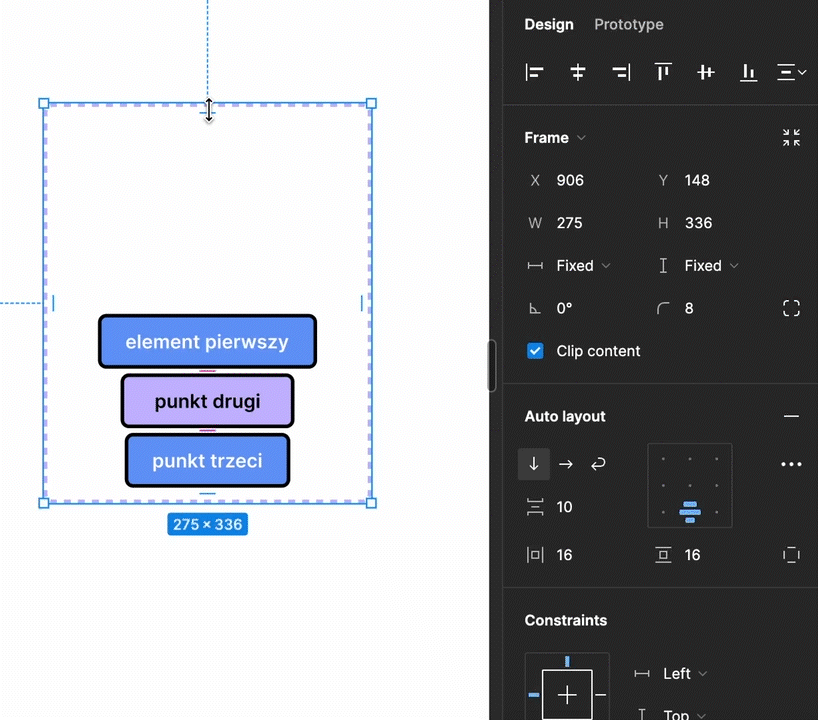
Another Auto-Layout property is Direction. You can set the direction of a frame to either horizontal or vertical. This determines whether the elements inside the frame are arranged horizontally or vertically. There’s also the option to wrap content. This is particularly useful as it allows content elements to wrap to a new line in response to text expansion.
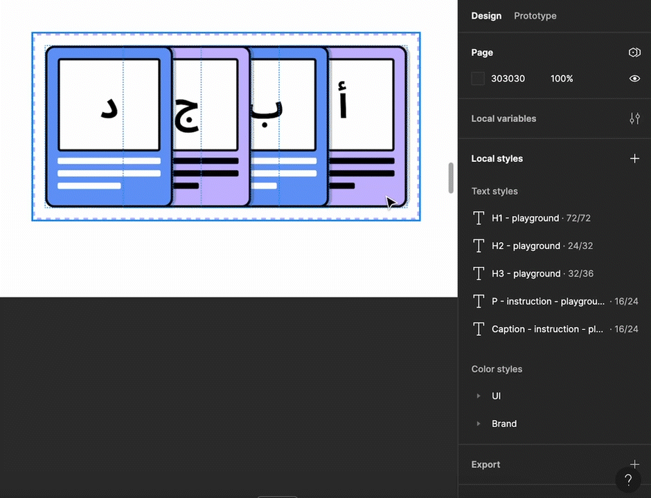
Auto-layout also has the option to easily adjust spacing between items and the padding surrounding items. Both of these can be manipulated either in the Auto-layout panel or directly on the canvas. This can be helpful when components' size changes thanks to text expansion. For example, you can expand the padding between elements to prevent text overlap.
There are a few more advanced Auto-Layout properties that can help more easily adjust designs to different languages.
Many of these options are combinable to produce a complex layout that is easier to adjust per language. You can even add an Auto-Layout frame within another Auto-Layout frame. While we tried to call out some of the most helpful options, please note that this is not an exhaustive, nor complete list of all available Auto-Layout properties.
For more detailed information on enabling and using Auto-Layout in your Figma designs, see Figma’s documentation for Using Auto-Layout and Exploring Auto-Layout Properties. Figma even provides an auto layout playground so you can experiment and learn your way around each option.
By leveraging these Auto-Layout features, designers navigate localization intricacies more easily, creating visually cohesive designs ready for all markets. Integrating localization into the design stage eases the development effort coming after, helps to spot and solve issues early, and encourages successful global launches. Figma's Auto-Layout properties act as a valuable toolkit, empowering designers to craft designs that transcend language barriers and resonate globally.

Untangling the confusions in Apple’s localization file format jungle. When and how to use .strings, .stringsdict, .xcstrings and .xcloc.
Read the Full Article
Master key naming conventions and file structure to help ensure a seamless localization process
Read the Full Article